


2UTech
Thibault Pelette was launching his systems & network infrastructure business in Limoges. The problem: he had solid expertise, but no identity. No established name, no logo, no guidelines, no site. Nothing a prospect could land on when searching for what he does.
Everything started from zero
This is the kind of project I love: the complete blank page. We built the brand from A to Z, in order.
- The name and its meaning. "2U" reads as a wink — "to you", but also "universal utilities". A brand that speaks to the client before it speaks tech.
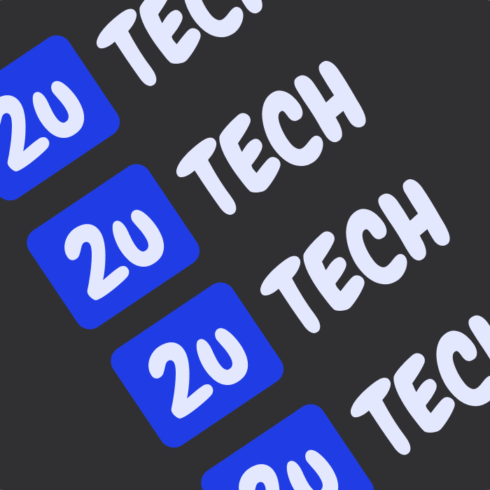
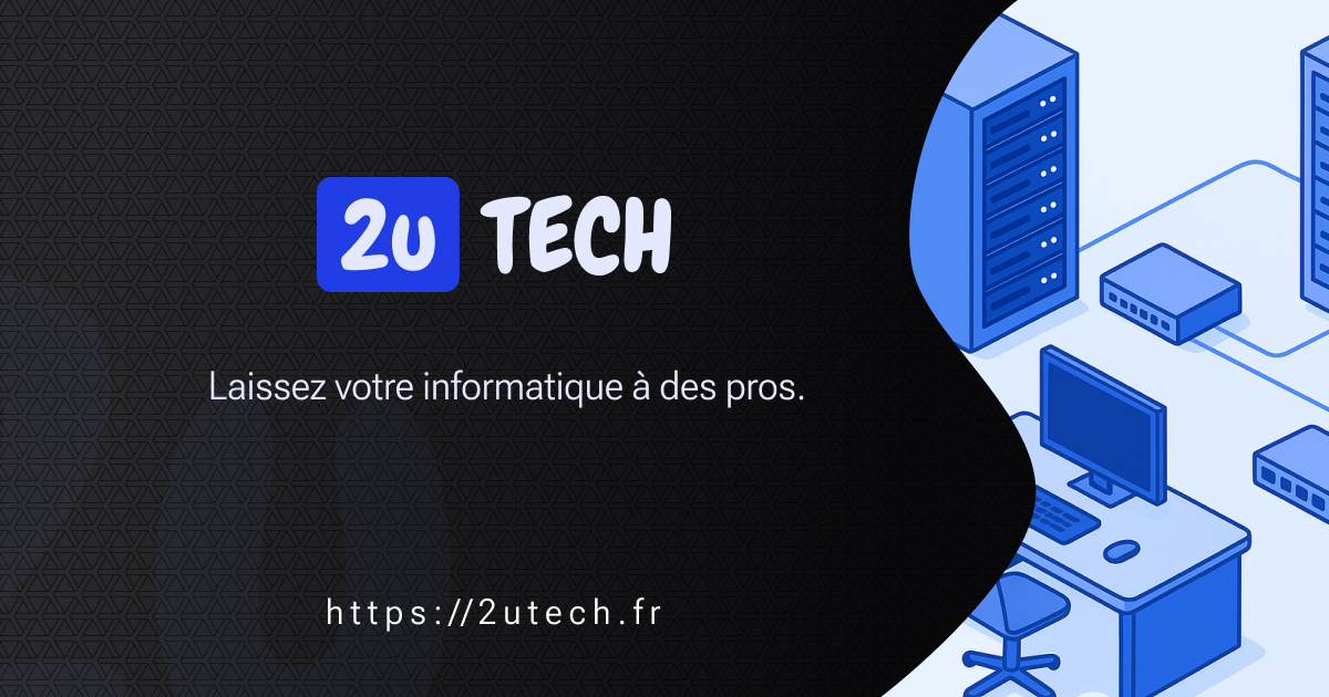
- The logo. Slightly playful shapes, a tech blue, to embody an accessible, approachable infrastructure rather than a cold, intimidating one. Crafted in Illustrator.
- The full visual identity, usable across every touchpoint.
- The copywriting, to turn technical services into clear benefits.
The site
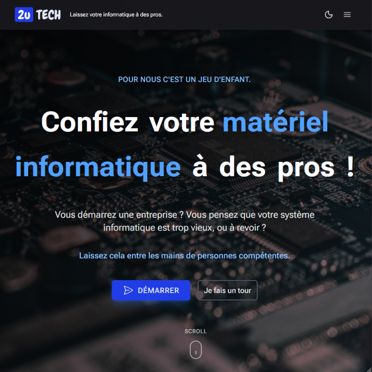
A modern, coherent showcase aligned with that brand, built in Nuxt 4, with a contact form wired to Resend, hosted on Infomaniak (and its environmental commitment, in line with the positioning).
The result
A business finally visible online, with a defined target audience and a fully bespoke brand. Thibault went from "expert without a storefront" to an online presence that actually looks like his craft.
Measured performance
Lighthouse (PageSpeed Insights), desktop, June 2026: a Performance score of 92/100, a Largest Contentful Paint of 1.8 s, a First Contentful Paint of 0.5 s and near-perfect visual stability (CLS 0.007). Far from a plugin-heavy WordPress.